Manasseh Furniture wanted to create an online an experience for it’s customers that was hip, cool and most of all visually stimulating. The goal was to keep most of the site white and clean and let the richness of color in the furniture be the hero. Navigation was to remain simple, with clearly marked next steps. In the end the goal was to make the website as delightful as the store itself.

Manasseh’s logo development was critical. They wanted a mark that was elegant, and chic, but was still timeless and could resonate with today’s consumer.

We kept the color palette simple with a warm blue and cooler grays to provide contrast. We decided to leave the bold purple color is a highlight to appear from time to time to add interest throughout the site.

Aspirational was the word that came to mind the most when choosing images for this site. Manasseh felt it was important to visualize yourself in all of these environments, but most of all, it was important to actually be able to afford all of these elegant pieces.

A sans serif font like Roboto Light was an easy choice. It’s clean lines were a great compliment to the photography and the color choices when building the site.

One of the first things we did was draft personas in collaboration with the client. We identified various customers, their needs, motivations and behaviors, and carefully studied their existing processes through in-person interviews and online interactions.

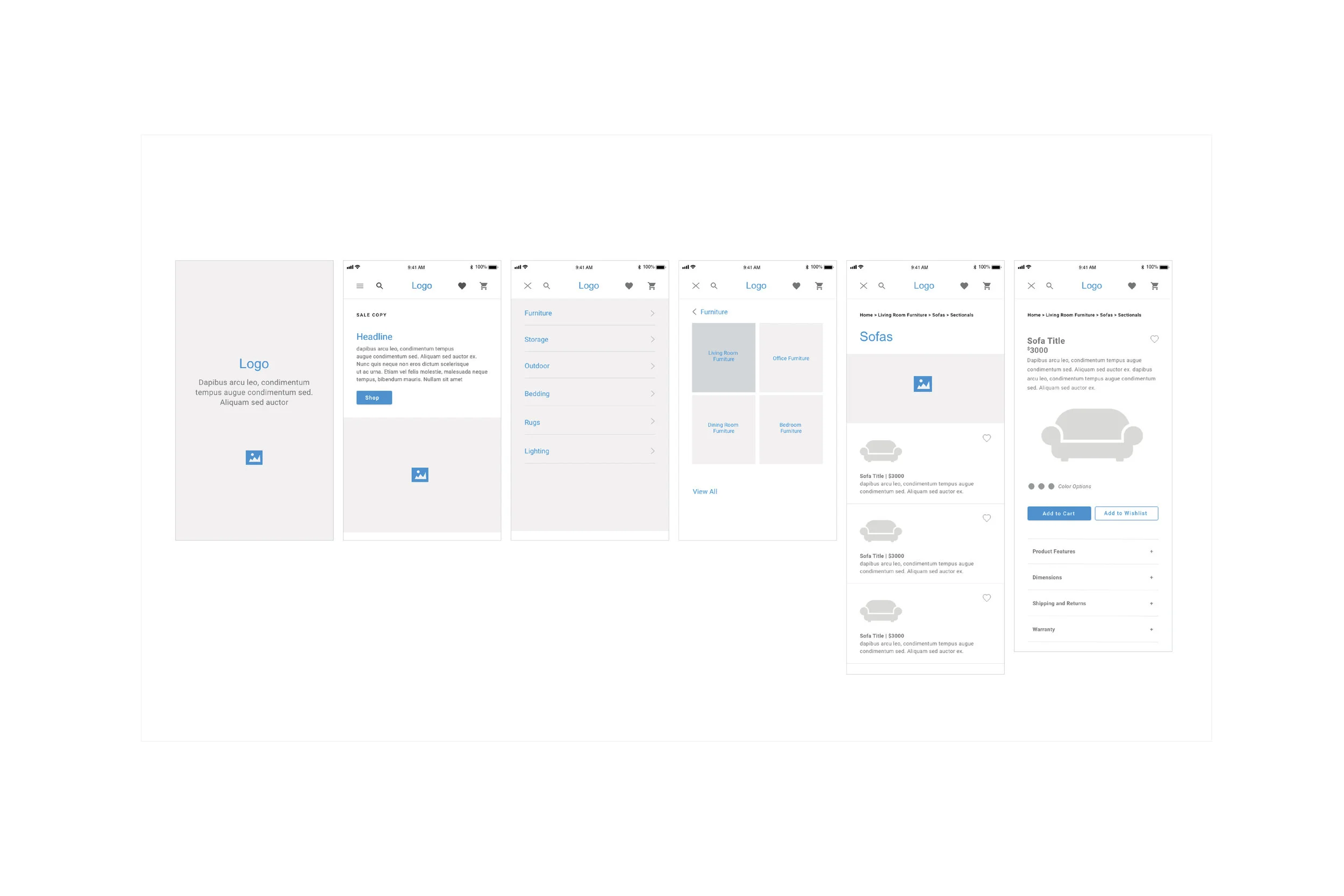
After many sketches, and brainstorming, the wire framing was the next step. Keeping things clean and letting the photography win was an easy choice. Once Manasseh approved the concepts, we moved to high fidelity mockups.


And all that transformed into the mobile app.
The end result was exactly what the client wanted.
A site that was functional, elegant and timeless.