The crossfit revolution is everywhere. Everyone has a vision and a strategy on how to get the most out of their body. Rebel Crossfit realized that. They didn’t want to change the world, they just wanted to “keep them inspired.” That was one of the request from the CEO. The other was to just keep things simple.

For the logo design, we wanted a mark that was bold, but still showed movement. After many iterations, we landed here. It was important that the logo could live with or without the wordmark beneath it.
We kept the color palette two colors for simplicity. We know that the color yellow is uplifting and energetic, and the color orange was going to bring warmth.

Photography was going to carry the design. We wanted to keep the user inspired by capturing people in the moments—before the moment. Chalking up before the lift, the effort in one more rep. Always looking for inspiration.

Roboto Light was the font choice. Clean san serif font ensured readability throughout the site.

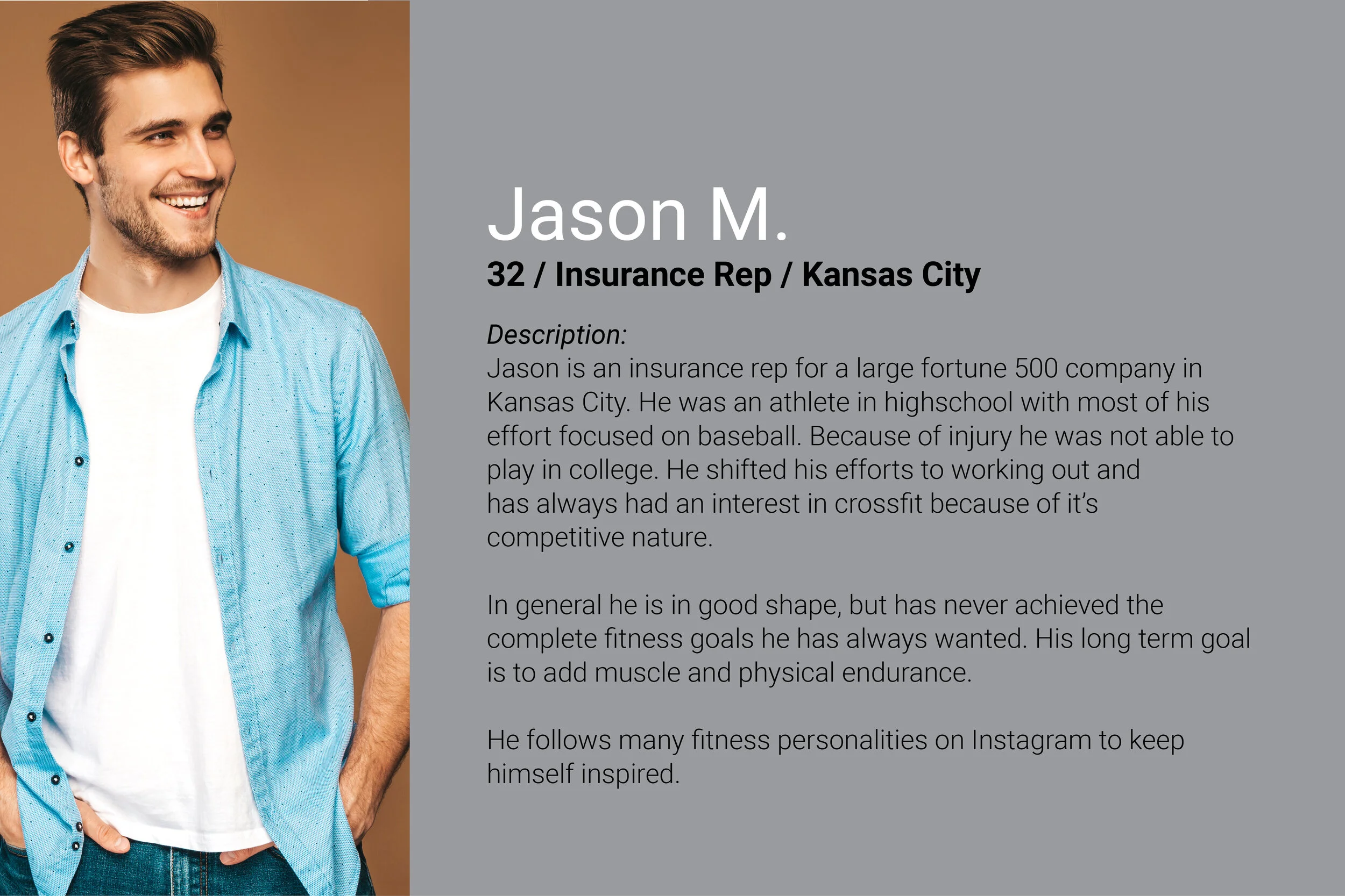
We knew our target users were weekend warriors and ex-athletes that still searched for something that could keep them in shape and re-ignite their competitive fire.
We started by building wire frames for the site, and rolled that into high-fidelity mockups. Once those were approved and client adjustments were made, we transitioned the design into the mobile app.
In the end the client was pleased with the functionality of the site and membership enrollment to Rebel Crossfit increased by 39%.


