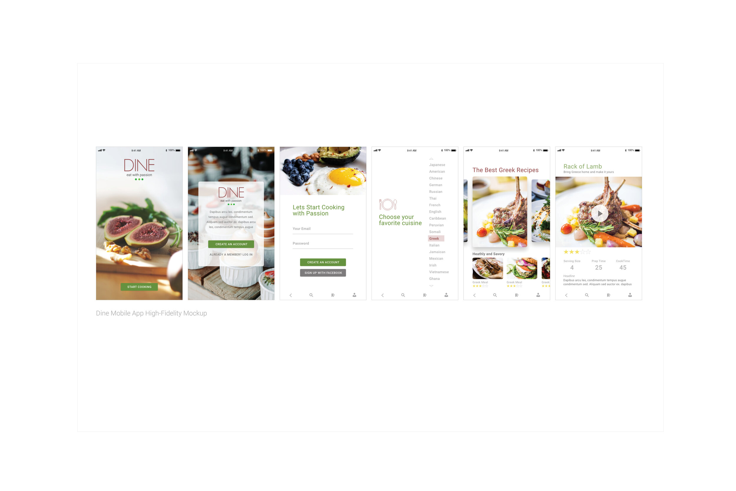
Dine is a mobile app that was struggling to capture the attention of a younger audience. They also realized that were long overdue for an a design refresh and more modern photography.

The Dine logo was built with a san serif font that was strong enough to hold up on top of an image, but elegant enough not to overwhelm it.
The fig has always been our inspiration. We kept the colors rich to mirror the fruit and it’s textures, and added the green to emphasize the life that a healthy diet brings.

Simply put, the food is everything. So, when refreshing the photography, we knew it had to be beautiful, decadent, lush and full of color.

Roboto Light was used for the logo creation and for the body copy throughout the app.

When building their persona, we kept in mind that Dine’s desire was to reach the younger audiences. Their goal was to target Millennials and remind them of how easy simple Dine could make meal preparation.

We kept all those things in mind when building out the wire frames. After the clients approval you pushed out the high-fidelity mockups and the prototypes.
In the end the app has had a 27% increase in downloads since the redesign.